|
|
Post by Jose G. on Aug 25, 2008 23:27:25 GMT -8
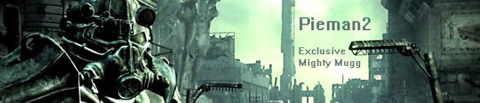
the other t-shirt designs were less than well received so let's take a poll on attempt #3 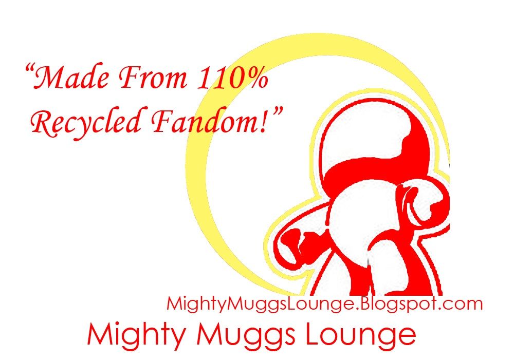 Also to make it more affordable, this image will go on the front of the T, only one sided. Let your voices be heard! |
|
|
|
Post by schrodingerscat on Aug 25, 2008 23:38:21 GMT -8
Looks like a logo for The Mighty Church of the Mugg. I like it though, maybe on black though.
|
|
|
|
Post by thewhiteshadow34 on Aug 25, 2008 23:41:16 GMT -8
Looks like a logo for The Mighty Church of the Mugg. I like it though, maybe on black though. LOL. I'd join The Mighty Church of the Mugg. Good call. |
|
|
|
Post by SMC on Aug 26, 2008 3:05:21 GMT -8
i dig it...the only changei would make is making the 'recycled from' line insmaller font and under the MML at the bottom. but i like the way that the Mugg looks and the halo like glow the yellow makes around it. well done Jose!
|
|
|
|
Post by Joeofmars! on Aug 26, 2008 4:59:50 GMT -8
I like, I like.
|
|
|
|
Post by muggman on Aug 26, 2008 5:02:02 GMT -8
not so much
|
|
|
|
Post by bobamugg on Aug 26, 2008 8:12:24 GMT -8
I like it.
|
|
|
|
Post by yugnella on Aug 26, 2008 9:07:35 GMT -8
I like the idea, but I'm not a fan of the execution. Just an opinion. I like the fact that it was made though. I can't get around to making my own dinner.
|
|
|
|
Post by sam71167 on Aug 26, 2008 10:48:39 GMT -8
I like it. Darker colors would be cool.
|
|
|
|
Post by Mightyfanatic on Aug 26, 2008 16:44:28 GMT -8
<cue cliche snarky televangelist/used car salesman voice> Friends, and you are ... my friends..... Looking at this heavenly design of our dear Mugg, I can not help but notice the halo emanating from his head... (Can I hear a hoo-boy...)
Crowd: Hoo-boy!As foretold in the book of Hasbro, and the Vinyl prophets, this is your opportunity to witness to your Mugg-challenged acquaintences ... and support the Mighty Muggs Lounge, now and Forever... Crowd: Hoo-boy!  Seriously, though, much more colorful then before (would probably contrast best on a dark shirt), and much more arty then the previous "stoic" design. But as always, it's up to the mob members here....  |
|
|
|
Post by yugnella on Aug 26, 2008 19:48:36 GMT -8
Just a thought...
Should we hold a contest? Maybe have a deadline for when submissions are due and let the Mugglic (Mugger Public) decide? That could be fun and might get some of our creative juices flowing.
|
|
|
|
Post by bobamugg on Aug 27, 2008 9:33:40 GMT -8
But I agree it would be good on a black shirt. |
|
|
|
Post by jukeboxhero on Aug 27, 2008 20:51:57 GMT -8
Hi Guys, I just wanted to throw out an idea I had based off the other design. Jay 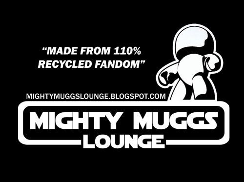 |
|
|
|
Post by thewhiteshadow34 on Aug 27, 2008 21:39:32 GMT -8
Jukeboxhero - I like your design. A small suggestion, if you care to hear, would be dropping the web address to the bottom. The upper half of the design is so strong, I'd like to just see that. It might also help to have the same font for "Made from 110%..." as the web address.
I also think the Mugg design could work huge in the center (maybe overkill? just thinking aloud here) or off to the left side (a Mugg bumper sticker?)
Just my two cents, but seriously, GREAT (GREAT!!!) work.
|
|
|
|
Post by bobamugg on Aug 28, 2008 5:19:22 GMT -8
Yeah Jukebox, I love that concept, with the starwars type font and what not.
Great work.
|
|